Please see detailed description of the usage tab in your app - these figures represent daily usage and you can tap a different day to view previous days. The information displayed depends on the type of meter you have.
Last 30 Days Usage Cost
Your last 30 days usage cost is a rolling total of your usage costs in the most recent 30 days. While the Usage cost in question can be very similar to the "Usage" cost in your Amber bill, and it can be a helpful tool to provide a rough estimation of what your upcoming bill will look like; there are some key differences to look out for when comparing to your actual Amber bill:
- The timeframes are different: Your Amber bills normally will be set on a fixed monthly billing period e.g. 15th Feb - 14th March. Your last 30 days usage shows the most recent data of your most recent 30 days usage cost information e.g. if you are viewing this on the 25th March, you will be seeing usage cost data from 23rd Feb to 24th March. As such, the usage costs can be different.
- Solar Export Feed-in Tariffs: In your Amber bill, the "Usage" cost from drawing from the grid and your "Solar Exports" are shown in separate sections (namely your "Charges" and "Credits"). In your "last 30 days usage costs", the figure shown represents your Usage minus Solar Exports.
- Negative Solar Feed-in Tariffs: If over the course of a billing period, your average solar exports are negatively priced (this is most commonly seen during Summer), the negative export pricing will be taken into account in your "last 30 days usage cost" but will be capped at $0 for your Amber bill. For instance, if you exported 100kWh of solar over the month at -2c/kWh (-$2.00 total); your "last 30 days usage costs" will be $2.00 higher than your Amber bill. You can read more about negative FiT here: Why is my Feed-in Tariff (FiT) occasionally negative or extremely low in the app?
- Non-usage related charges: Your Amber bill will also include other charges that are passed through to you at wholesale rates that are not shown in your "last 30 days usage cost". The most common examples include your Daily charges (e.g. Network Charges, Metering Charges), your Amber Subscription Fee, and your Demand charges. If you want to know more about details and what each charge means, you can read more about them in our interactive Bill Explainer.
General Meter
- Usage cost is the total of your per kwh costs for that day, excluding monthly and daily charges. The description underneath compares your total cost against the DMO - you'll see savings when you use most of energy at cheaper and greener times.
- Total Usage is how much energy is used throughout the day. The description underneath compares your total against your 90 day average. Using less power will result in a drop in that figure.
- % Renewables represents the amount of renewables available versus demand in the electricity grid at any one time. When this value is higher it means you are using energy at more renewable times, when there is more wind and solar in the grid. The description underneath compares your usage with the average usage across your state. By shifting your load to greener and cheaper times, you're helping the grid and saving money :)
- Average Price Paid depends on whether you used most of your energy when prices were cheap. The description underneath compares your usage with the average usage across your state. By keeping an eye on the app, you can choose to use your energy-intensive appliances when prices are low.
Controlled Load Meter
- Usage cost is the total of your per kwh costs for your controlled load, excluding monthly and daily charges. The description underneath compares your total cost against the controlled load DMO - you'll see savings when prices are cheaper during times that your controlled load is active. The active times depend on your network tariff so please reach out if you'd like more information about this.
- Total Usage is how much energy is used by your controlled load. The description underneath compares your total against your 90 day average. If your controlled load powers a hot water heater, using less hot water over a day, will result in a drop in that figure.
- % Renewables represents the amount of renewables available versus demand in the electricity grid at any one time. When this value is higher it means your controlled load is using energy at more renewable times. The description underneath compares your usage with the average usage across your state. If your network supports controlled load usage during the day, you'll likely see a boost in this figure as there is more wind and solar in the grid. Enabling your controlled load during the day depends on your network tariff so please reach out if you'd like more information about this.
- Average Price Paid depends on whether your controlled load used the most energy when prices were cheap. The description underneath compares your controlled load usage with the average usage across your state. Historically, prices were cheaper overnight when there wasn't as much demand in the grid. Nowadays, thanks to renewables, prices can be cheaper during the daytime so reach out if you'd like more information about your network tariff.
Solar Meter
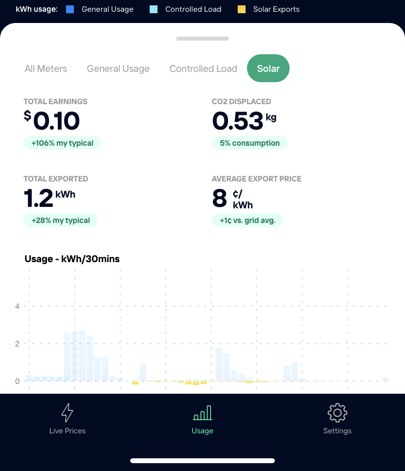
- Total Earnings is the total earnings for your solar for that day. The description underneath compares your total earnings against your 90 day average. You'll see higher figures when electricity demand exceeds supply and where rooftop solar can be used to help ease stress on the grid.
- Total Exported is how much excess energy was exported to the grid from your solar panels. The description underneath compares your total against your 90 day average. If your household doesn't use the energy being generated by your solar panels, it will be exported to the grid.
- CO2 Displaced represents the amount of carbon emissions avoided due to your solar generation. The description underneath compares how much solar energy you exported with how much energy you used from the grid. To boost this figure, you should shift energy-intensive appliance to run when the sun is shining.
- Average Export Price depends on whether you exported the most energy when prices were high. The description underneath compares your solar exports with the average exports across your state. In the middle of the day, when most solar is available, prices are generally cheaper. If you want to maximise the value of your solar energy, you could think about adding a battery to your existing set up.
Comments
Article is closed for comments.